A health coach in Chicago had 22,000 Instagram followers and a bio page with seven buttons. She was getting 310 bio page visits per week and about 19 clicks. That is a 6 percent click rate. She tried posting more, changing her content pillars, and updating her bio text. Nothing moved the number significantly.
Then she made four of the nine changes in this post. Within three weeks, her weekly clicks were at 67. Same 22,000 followers. Same posting schedule. Same audience. The click rate had gone from 6 percent to 21 percent. The only things that changed were on the bio page itself.
This post breaks down the nine decisions that consistently move bio page click rates, why each one works, and what to change right now on your page.
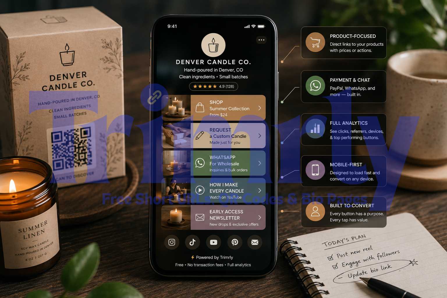
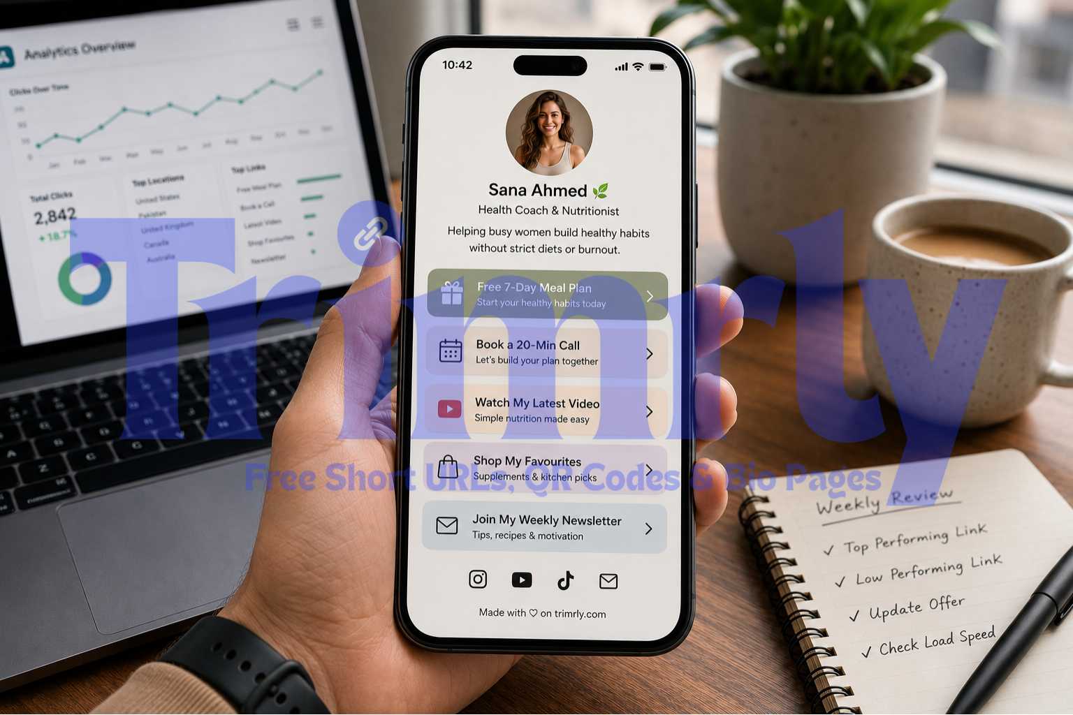
Most bio page buttons are named after the destination: "Website," "Shop," "YouTube," "Instagram." These labels tell the visitor where the button goes. They do not tell the visitor what they get when they get there. Destination labels are passive. Action labels are specific and direct.
"Shop"
"YouTube Channel"
"My Newsletter"
"Links"
"Shop the Summer Collection"
"Watch My Latest Pottery Video"
"Get the Free Weekly Recipe"
"Download the Starter Guide"
The distinction changes the decision the visitor is making. A passive label forces them to guess whether the destination is worth their tap. An action label tells them exactly what they will receive, which reduces hesitation and increases click rate. The more specific the label, the better it performs. "Shop" is vague. "Shop the Ramadan Collection" is specific. "YouTube" is a platform. "Watch: How I Built a $10K Etsy Shop From Scratch" is a reason to tap.
On Trimrly's bio page builder, button labels are fully customizable with no character limit. Edit every button label before you share the page. This single change typically produces a 20 to 40 percent increase in click rate on its own.
The most common bio page mistake is adding every possible link. Seven buttons, nine buttons, twelve buttons. The assumption is that more options increase the chance that something gets clicked. The data consistently shows the opposite.
When visitors face too many options, they make none. Psychologists call this decision paralysis. On a bio page, it means the visitor scans the buttons, feels overwhelmed or uncertain, and leaves without tapping anything. Each additional button dilutes the attention available for every other button.
The target is three to five buttons. Put your highest-priority action first. Put your second-priority second. Anything that does not deserve one of the top four spots should be removed or merged. A monthly review of your Trimrly analytics shows you which buttons are getting zero clicks. Remove them without guilt. They are costing you clicks on the buttons that matter.
If all your buttons look the same, the visitor has no visual signal about which one matters most. Their eye lands randomly, scan direction is unpredictable, and click intent disperses across all buttons equally. Equal styling creates equal indifference.
Button hierarchy works by creating visual contrast. Your primary button should be the most visually prominent element on the page after your name. Your secondary buttons should be clearly less prominent. The visual gap between them is the design doing work that the label alone cannot do.
In practical terms: your primary button gets your brand's strongest color fill with white text. Secondary buttons get a lighter version of that color, an outline, or a contrasting accent. Tertiary buttons get a minimal or neutral style. The visitor's eye immediately knows where to go first.
Primary (filled, brand color, largest visual weight): your single most important action right now. Secondary (outlined or lighter fill): two or three supporting actions. Tertiary (minimal, muted): everything else. If you cannot identify which button is primary, neither can your visitor. Pick one and commit.
Bio pages with real human profile photos consistently outperform those with logos, illustrations, or placeholder icons on click rate. The reason is trust. A face reduces the psychological distance between the visitor and the person behind the page, which lowers the friction before a tap.
The photo should be recent, well-lit, and clearly show your face. A dark, blurry, or heavily filtered photo signals low production quality, which bleeds into the visitor's perception of the rest of the page. A clean, professional headshot does not need to be taken by a photographer. Natural window light and a phone camera produce a more trustworthy result than a studio shot with a generic background.
For businesses and brands, a clean logo on a solid background outperforms an abstract or complex brand mark. The key is that the image should be immediately recognizable at small sizes. Bio page profile photos display at 60 to 80 pixels on most mobile screens. At that size, complexity disappears and clarity wins.
Shrink your profile photo down to 48 pixels wide on your computer screen. If you cannot clearly identify who or what it is at that size, it needs to be replaced. Most mobile visitors see your photo this small. If it does not read clearly at 48px, it is not building trust at the moment it most needs to.
The bio description directly above your buttons is the most underused real estate on a bio page. Most creators use it to describe themselves in general terms: "Content creator. Fitness lover. Dog mom." This is the equivalent of a shop window display that says "I sell things."
A headline that primes the first button converts significantly better. The mechanic is simple: the description creates anticipation for what comes next, and the first button delivers it. When the two are aligned, the tap feels natural rather than deliberate.
The second description tells the visitor exactly what is waiting for them in the first button. Before they have read the button label, they already know what it does and why it matters. That context eliminates the hesitation that generic button labels create on their own. The arrow emoji pointing down at the button is not decorative. It is a direction that measurably increases tap rates on the button it points toward.
Color is not a style decision on a bio page. It is a trust and recognition signal. A visitor who arrives from your Instagram has already formed a visual identity association with your brand from your grid, your stories, and your videos. A bio page that uses completely different colors creates a subconscious mismatch that reduces trust.
Consistency wins over personal preference. If your Instagram content is dark and moody with warm earth tones, a pastel blue bio page feels like a different brand. If your content is bright and high-contrast, a muted gray page deflates the energy your content built up. Use your primary brand color as the button fill for your primary CTA. Use a complementary or neutral color for the background.
Separately from brand consistency, contrast matters for accessibility and conversion. White buttons on a light gray background have poor contrast. Dark text on a dark background is invisible to some visitors. The WCAG minimum contrast ratio for readable text is 4.5:1. Below that, a portion of your visitors are effectively locked out of reading your button labels clearly, which reduces clicks without any obvious visual reason.
Screenshot your bio page and convert the image to grayscale. If your buttons disappear into the background when all color information is removed, your contrast is insufficient. Sufficient contrast means your buttons remain clearly visible even in grayscale. This test also replicates how your page looks to visitors in bright outdoor sunlight on a mobile screen, which is a common viewing scenario.
Load speed is the conversion variable nobody talks about on bio pages. A visitor who taps your bio link arrives from a social media app. They are on mobile, often on a cellular connection, and they are operating with a very short attention window. Research on mobile landing pages consistently shows that conversion rates drop 20 percent for every additional second of load time beyond two seconds.
The main causes of slow bio pages are large, uncompressed profile photos, too many embedded widgets loading external scripts simultaneously, and heavy background images or gradients. An embedded YouTube video, Spotify player, and Instagram post loading simultaneously on page open can add 3 to 5 seconds to load time on a typical cellular connection.
On Trimrly, bio pages are hosted on fast infrastructure and are optimized for mobile load performance. The main variable you control is the embedded content. If you have multiple embeds, consider whether each one is pulling enough clicks to justify the load time it adds. Check your Trimrly analytics: if an embedded element gets fewer clicks than the buttons above it, it is slowing your page without contributing proportionally to your results.
Open your bio page on your phone with Wi-Fi turned off and only cellular data active. Count the seconds from tap to fully loaded page. If it takes more than 2 seconds to show the buttons, your load time is reducing your click rate. Identify and remove the heaviest embedded elements until you are consistently under 2 seconds on cellular.
The mechanics of attention on a bio page are identical to the mechanics of attention anywhere in digital marketing: specificity and urgency convert better than vagueness and permanence. A button that has been on your page for six months with no changes feels like it will always be there. A visitor who is not sure they need it now will assume they can come back later. Most do not come back.
Time or scarcity language removes that assumption. It is not about manufacturing false urgency. It is about being honest when something is genuinely time-limited and being specific about what the visitor gets right now.
"Shop My Presets"
"Get the Guide"
"June Collection — Ships in 2 Days"
"Free Guide: Updated for 2026"
These labels require you to actually update them when the specific information changes. A button that says "4 coaching slots left" when you actually have 20 available is false scarcity and damages trust with anyone who finds out. Real specificity, kept current, consistently outperforms generic permanence because it gives visitors a concrete reason to act today rather than later. Update the primary button label at least once per month even if just refreshing the current offering language.
This is the change that makes all the others compound over time. The eight tips above are based on general research about what works across bio pages. Your analytics tell you what works for your specific audience, which is the data that actually matters.
Trimrly's free bio page analytics show click counts per button, total page visits, device breakdown, and click timing. A Monday review takes four minutes and reveals three questions with actionable answers:
- Which button got the most clicks this week? That is your audience's top priority right now. Move it to the first position if it is not already there.
- Which button got zero or near-zero clicks this week? That button is failing for one of three reasons: the label is unclear, the offer is irrelevant to your current audience, or the position is too far down the page for most visitors to reach. Remove it or move it up and retest.
- What time of day did most clicks happen? That is when your audience is active. Post new content in the 30 minutes before that peak and mention your bio link explicitly in the caption.
The compounding effect is that each weekly adjustment puts your best-performing button first, removes friction from underperforming ones, and aligns your posting schedule with your audience's active window. Over 8 to 12 weeks, these micro-adjustments produce a substantially different page than the one you started with, and a substantially higher click rate than any single change alone would deliver.
Unlike some bio page tools that delete analytics after 28 days on the free plan, Trimrly stores every click permanently. This means week eight's review can reference week one's data for genuine before-and-after comparison. Free account, no expiry on the data, no credit card required to access it.
"The bio page that converts 15 percent is not better designed. It is better tested. Every high-converting page started somewhere lower and improved one decision at a time."
Build Your Bio Page and Start Tracking Clicks Free
Full per-button analytics. 45+ widgets. No forced branding. No 28-day data expiry. Five bio pages per month on the free plan, permanently.
The 9 Changes: Quick Reference
Here is every tip condensed into a single reference table with the expected impact on click rate and the effort required to implement each one.
| # | Change | Expected Impact | Effort |
|---|---|---|---|
| 1 | Rewrite button labels as actions | +20–40% clicks | 10 minutes |
| 2 | Reduce buttons to 5 or fewer | +15–30% per button | 5 minutes |
| 3 | Add visual hierarchy to buttons | +10–20% on primary | 5 minutes |
| 4 | Replace logo/icon with real photo | +8–15% overall | 2 minutes |
| 5 | Rewrite bio to prime first button | +15–25% on primary | 15 minutes |
| 6 | Match colors to brand, fix contrast | +5–12% overall | 10 minutes |
| 7 | Reduce page load time under 2 seconds | +20% overall | 10–20 minutes |
| 8 | Add time or scarcity language | +10–20% on primary | 5 minutes/month |
| 9 | Weekly analytics review and adjustment | Compounds all above | 4 minutes/week |
Before You Share Your Bio Page: A Final Checklist
- ✓
Every button label starts with a verb and tells visitors what they get, not where they go. No button is labeled with just a platform name or a generic noun.
- ✓
There are five or fewer buttons and you could explain why each one is there if someone asked. Any button you are unsure about has been removed.
- ✓
The first button is visually the most prominent with a filled color treatment that makes it immediately distinguishable from every other button on the page.
- ✓
Your profile photo is a real face photo taken in good light, clearly recognizable at 48 pixels wide, and taken within the last two years.
- ✓
Your bio description mentions what is in the first button and gives visitors a specific reason to tap it rather than a general description of who you are.
- ✓
Your page passes the grayscale contrast test: buttons remain clearly visible when the page is viewed in grayscale, indicating sufficient contrast for all visitors and bright-light mobile conditions.
- ✓
The page loads in under 2 seconds on cellular data. You have tested this by turning off Wi-Fi and timing the load on your own phone.
- ✓
Your primary button label includes something time-specific or current rather than a generic permanent label that has not been updated in weeks.
- ✓
You have a Monday analytics review scheduled and you know which two metrics you are checking: which button got the most clicks and which got the fewest.
Frequently Asked Questions
The average bio page converts 3 to 5 percent of visitors into at least one button click. A rate of 8 to 12 percent is considered strong. Rates above 15 percent are achieved by pages that have been systematically optimized using per-button analytics. Click rate is calculated by dividing total button clicks by total page visits. Note that click rate varies by niche: pages where the primary offer is free, immediate, and highly specific to the creator's content tend to convert higher than pages promoting paid products or generic storefronts.
Three to five buttons is the range that consistently produces the highest per-button click rates. Below three, you risk excluding destinations your audience actively wants. Above five, decision paralysis reduces click rates on all buttons, including your most important one. The right number is ultimately determined by your analytics: check which buttons are getting zero or near-zero clicks per week and remove them. If all five are getting meaningful clicks, keep all five. If one is getting 80 percent of clicks and four are getting almost nothing, simplify to three or four.
Yes. Trimrly's free plan includes per-button click tracking on every bio page, with device breakdown, country data, referral source, and timestamp for each click. This data is stored permanently with no 28-day expiry. This level of analytics is typically locked behind paid tiers on tools like Linktree. On Trimrly, it is included in the free plan from day one with no credit card required.
For individual creators, coaches, and personal brands, a real face photo consistently outperforms logos on click rate. A human face builds trust faster than a brand mark, particularly for audiences arriving from social platforms where they have been watching and following a person. For businesses and brands without a personal front, a clean, recognizable logo on a solid background is the correct choice. The key is that the image should be immediately identifiable at small sizes, typically 48 to 60 pixels on a mobile screen.
At minimum, review your bio page analytics every Monday and make one small change if the data suggests it. Update your primary button label at least monthly to reflect your current offer or campaign. Update the page immediately when you launch something new: a product, a free resource, a course, or a seasonal promotion. Your bio page should reflect your current priorities, not what you were focused on three months ago. The link in your social bio stays the same. Only the content of the bio page changes, which is why using a dynamic bio page tool like Trimrly is important. You update the page without touching your Instagram or TikTok bio.